Thursday, May 11, 2017

Assignment 5: REI Co-op Site Selection (Final)


1 Introduction 

REI is a national outdoor retail co-op committed to educating and outfitting its members and the community for outdoor adventures and stewardships. REI offers their own line of high-quality award-winning gear and apparel. This retail store also has top brands for camping, climbing, cycling, fitness, paddling, snow sports, and travel. REI is dedicated to promoting environmental stewardship as well as providing access to outdoor recreation. REI started as a cooperative (co-op) in 1938. Instead of being a publically traded company, REI focuses on long-term interests of the co-op and its members. Anyone can shop at REI, but the co-op members pay a $20 for a lifetime membership to gain a portion of the profits each year based on a few requirements. REI operates a business that impacts the growing outdoor participation and protects the environment for future generations.

1.1  Study Area

The area for this site selection will be looked at in Appleton, WI. Brown, Outagamie, Winnebago, and Calumet Counties are going to be contributing factors to the site selection as well as the defined study area (Figure 1). These counties contain come other major cities that could be beneficial or competitive for Appleton such as Green Bay and Oshkosh.
Figure 1. Counties that make up the study area.

1.2  Purpose of this Study

Around the study area, there are not many close REI locations. The primary spots are around Minneapolis-St. Paul, MN, Madison and Milwaukee, WI, and Chicago regions (Figure 2). REI wants to see if there are any locations that are worth putting a new location in northern Wisconsin.

Figure 2. Locations of REI in MN, WI, and IL.
Looking more into the metropolitan statistical areas (MSA) of Wisconsin, a claim can be made for the  defined study area above. For example, Figure 3 contains a map of the metropolitan areas in Wisconsin. Current locations are located in the Minneapolis-St. Paul-Bloomington, Madison, Milwaukee-Waukesha-West Allis, and Chicago-Naperville-Elgin metropolitan statistical areas. Just around the city of Appleton, there is the Appleton, Green Bay, and Oshkosh-Neenah MSA. The MSA that surround the city of Appleton are in a close proximity to potential locations for REI sites.

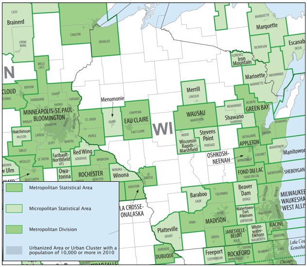
Figure 3. Metropolitan and Micropolitan Statistical Areas of the US (US Cenus 2015).

1.3  Scope of this study, sources, and methods

To understand the study area, a series of analyses will be completed, including: assessing the demographics of the study area, locating ideal customers, identifying trade areas, assessing the market structure, and selecting three sites and ranking them. Specifics of the demographics include the total populations, population density, and breaking down the age cohorts using the 2010 census data. The ideal customers tool uses a method that identifies the threshold of some variable at a geographic area such as zip codes. The market structure can then identify potential competitors if REI were to move into the city of Appleton. This will show if market saturation is a concern.
Retail Gravity Theory suggests that there are consistences in the behavior of shoppers. This can be determined with a mathematical analysis to make a prediction based on the concept of gravitation from a particular location. This relates to the point of indifference, which is the extremity of a city's trading area where households would be indifferent between shopping in that city (Appleton) and a different city. This gravity model will be used to relate to surrounding cities. This looks at potential cities such as Green Bay, Oshkosh, and Greenville.
And lastly, ranking sites allows one to see which sites could potentially out perform the others. The sites need to be selected based on an area that would be large enough for a REI to actually be built, not just a general location. A 1.5 mile buffer will surround the potential sites and must meet certain criteria in order to be selected.

2 Findings and Discussion

2.1 Demographics

In 2010 US Census, the City of Appleton contained a population of 72,623 people. In 2015, the Wisconsin Department of Administration estimated 73,737 residents in Appleton. It is projected that Appleton will have a steady increase in population. Figure 4 compares Appleton to three of the counties in the study area. This is beneificial to a potential growing market. 

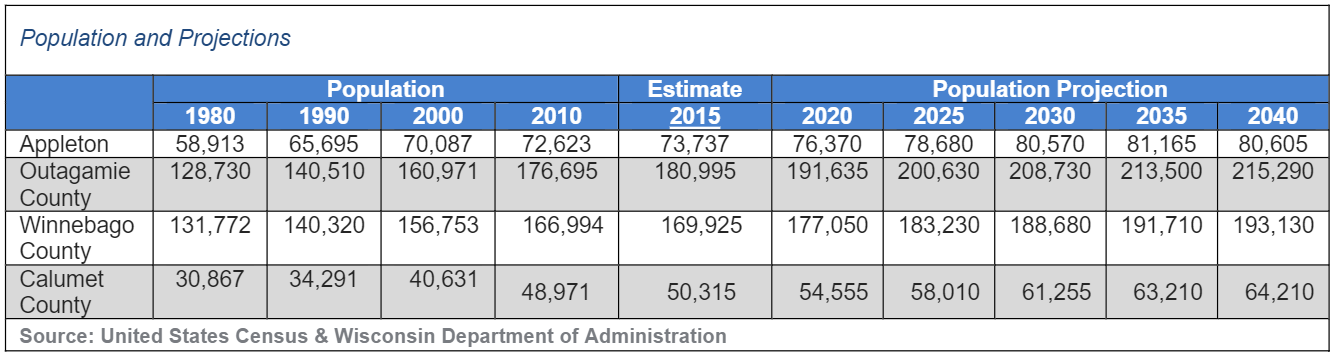
Figure 4. Population and Projections for the Study Area (US Census & WI Department of Administration).

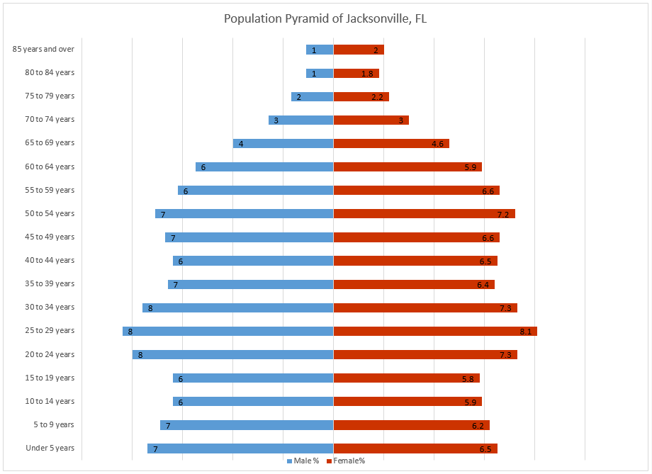
Looking at the age distribution of Appleton (Figure 5), 63.66% of the population is within the working class based on the 2010 Census. The median age for Appleton is 35.3 years old. This age is great for consumerism for this type of activity because the population is young enough to engage in such activities as well as be able to afford it by having a high percentage of a working population. Compared to surrounding large cities such as Oshkosh and Green Bay, Appleton has a higher percentage of the age cohort of 14 and under. Appleton also has a higher percentage of working adults in the 35 to 44 and 45-54 age cohorts comparatively.
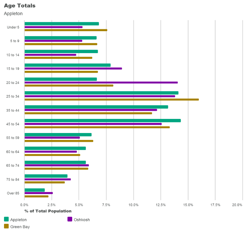
Figure 5.  Age Distribution of the City of Appleton (US Census 2010).

Figure 6 looks specifically at where the population is most dense. Like many situations for metropolitan areas, the population tends to be located closest to the downtown or the central city. To the west of Appleton are suburbs like Grand Chute that provide the location to the Fox River Mall as well as many of the other retail industries. 
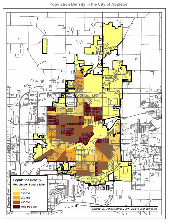
Figure 6. Appleton Population Density (Appleton Comprehensive Plan 2015). 

2.2 Ideal Customers

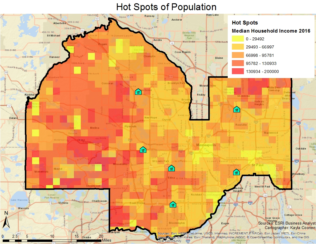
Typically the market for customers is in areas that are considerably more wealthy. Many of the 2010 Census tracts for this area have a considerable high or average median household income (Figure 7). Households that have an income of $45,000 and higher have a bigger influence on the consumer spending of Appleton. The darker green areas are predominantly located around the city boundary in more of the suburbs. However, they are still in close proximity to the city where the consumer spending is still going to have a high impact in the City of Appleton. 
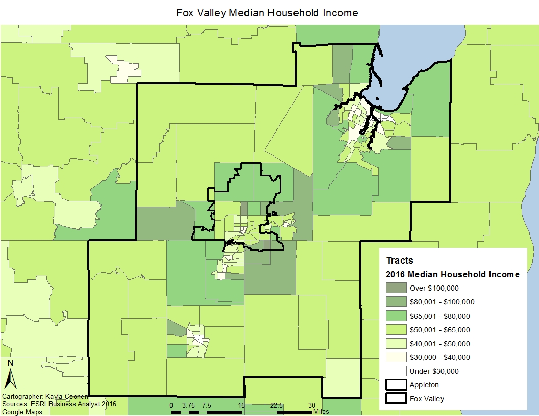
Figure 7. 2016 Median Household Income based on Census Tracts in the Fox Valley.

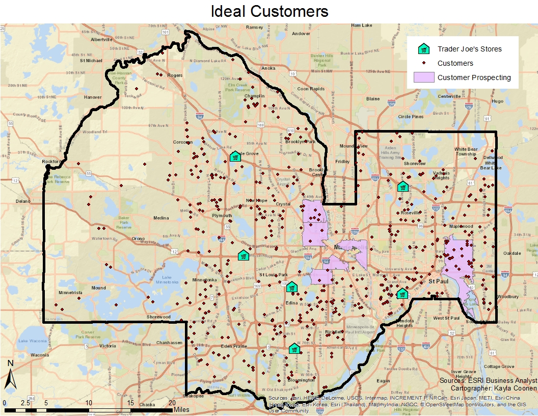
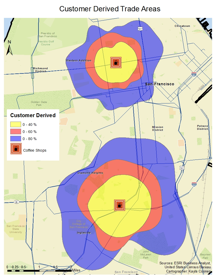
The ideal customers use a method that identies the variable at a geogrphic area. This included zip codes with a minimum of 20,000 people and a median household income of at least $45,000. The zip codes that met this critera surrounded the Oshkosh and Green Bay, shown in Figure 8. The fact that the potential sites are in between the two ideal customer areas is notable in reaching markets outside of Appleton.
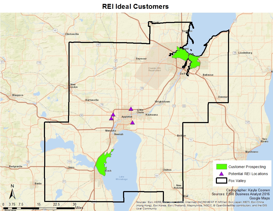
Figure 8. Customers prospecting in Winnebago and Brown County.


2.3 Market Structure

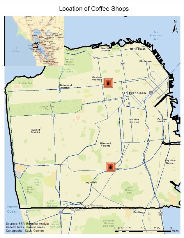
Much of the competition for REI is sporting good stores (Figure 9). Some of the big competitors that appeared multiple times are Scheels and Dick's Sporting Goods. These two competitors offer a variety of sporting goods from hunting, athletics, and outdoor apparel. REI offers different products that are primarily for the consumer looking for camping and outdoor activities such as biking, hiking, etc. While there are competitors in close proximity, REI sells many products that it's competitors do not giving it more of an advantage to locate here. 
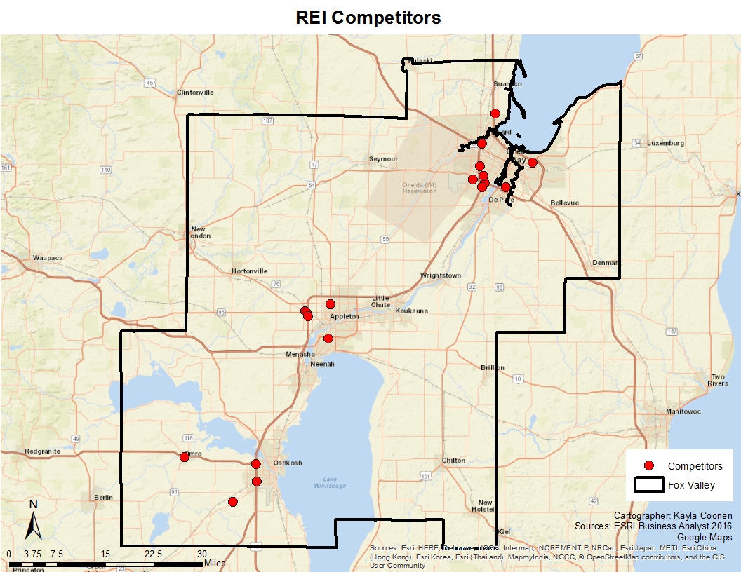
Figure 9. Competitors for REI.


2.4 Trade Areas

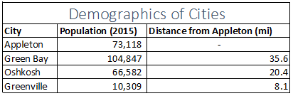
The Trade Areas were expressed for REI in this location using Reilly's Law of Retail Gravitation. The factors that first needed to be determined were three cities in different directions of Appleton. Green Bay, Oshkosh, and Greenville will be assessed based on their population and distance from Appleton, shown in Table 1. 
Table 1. Factors used in the Gravitational Model.
 Based on the Formula below the Retail Gravity Theory can be calculated:
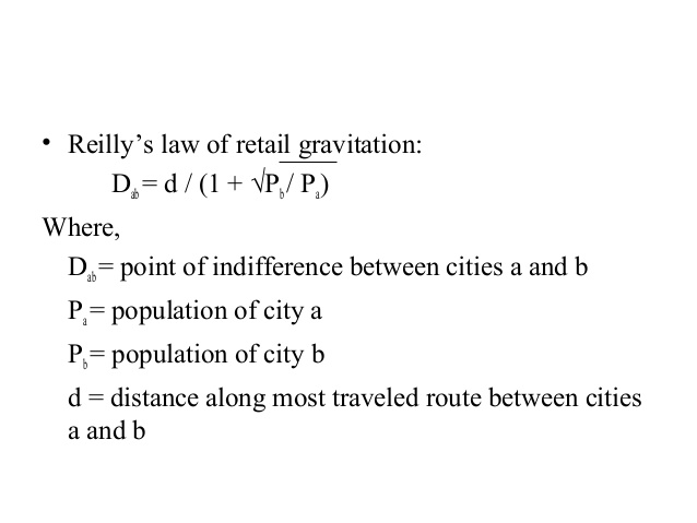
Using the formula, Table 2 shows the computed values for the retail gravitation. By taking the Distance from Appleton and subtract the calculated value, the point of indifference can be computed.
Table 2. Computed Values for Reilly's Law of Retail Gravitation.

Although this model does not account for every city that falls in between Appleton and the selected city, it can give a rough estimate of the distances that are willing to travel to Appleton. Figure 10 shows a triangulated area of area that would be willing to travel to Appleton that are in the midst of Green Bay, Oshkosh, and Greenville. Typically when this model is ran, cities are selected that have a lower population. However, in this case Green Bay has a larger population than Appleton. In the Fox Valley, Appleton, Green Bay and Oshkosh are similarly large cities and are located in a short distance of each other. The model was tested on Green Bay and Oshkosh specifically to predict how many would be willing to travel to Appleton if they lived near one of the other larger cities. Green bay is 35.6 miles away from Appleton, but based on it's point of indifference only 16.2 miles from Appleton to Green Bay would people be willing to shop in the City of Appleton. This leaves 19.4 miles leaning more towards shopping in Green Bay. But for those that are in Oshkosh, the distance is near half way that would be willing to travel to Appleton. 


Figure 10. Model of the Retail Gravitation based on miles.


2.5 Rank Sites

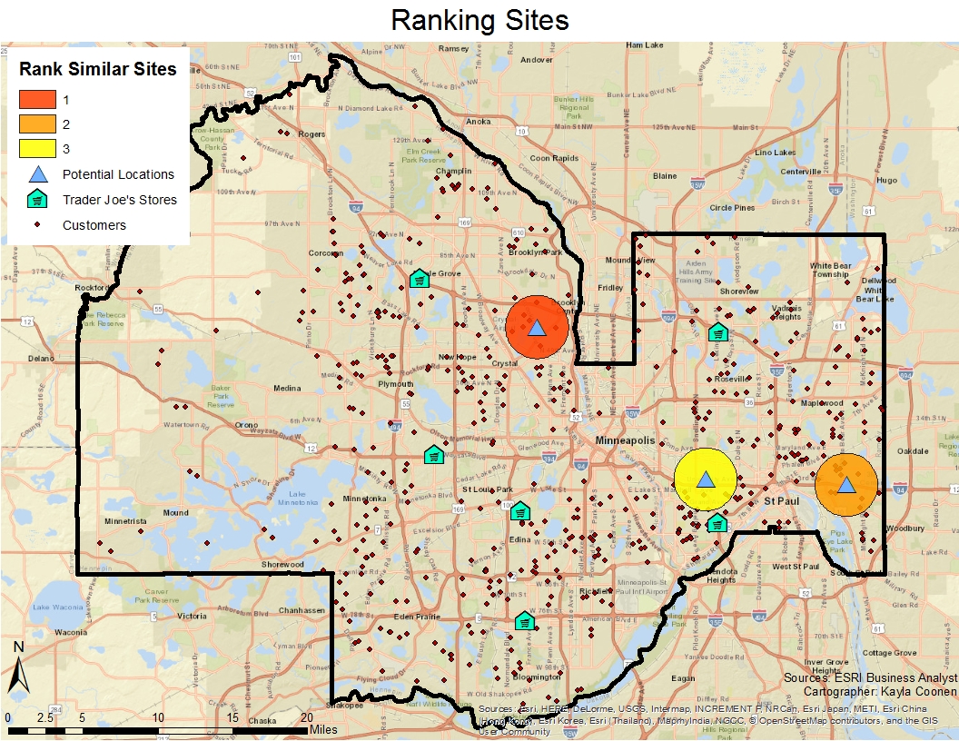
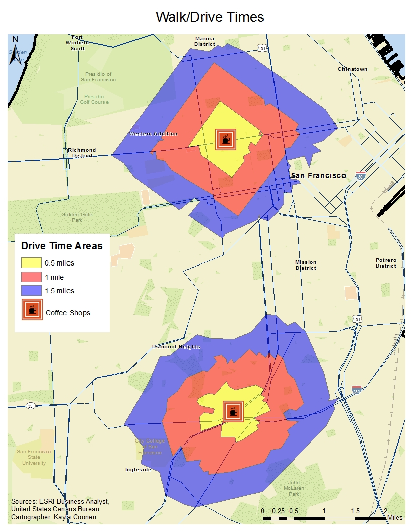
These sites that were selected were on empty lots in commercial areas within Appleton. With a 1.5 mile buffer around the four sites, variables were considered in order to see which sites may outperform others (Figure 11). The variables included 2016 Total Income, 2016 Median Household Income, and Outdoor stores. The sites were located in different developing areas around Appleton. One area was located in Appleton East, which is a Secondary Business District (SBD). This area was established and built up even more as the suburbs outside of Appleton grew in population and a Walmart was placed  next to the many residential areas. The Appleton North location that consists of a newly developed business district. This area also includes other recreational uses and many housing developments growing in the back of it. The other two sites that were placed on the west side of Appleton are in close proximity to the Fox River Mall. The one on the lower half is closer to Greenville, WI which is a city that has trend of population increase. Many businesses are moving to this are for future business development and it is on the outer bounds of the retail area established with the mall. The last location is around the areas where there is more outlet shops, a minor league baseball stadium, and it is in an area that can create competition with Dick's Sporting Goods and Scheels.
The location in Appleton North was the ranked as the number one site for REI to locate. There is not as much competition in this area. The people that live around that area tend to be in wealthier households. This area also has been developing greatly out to the Freedom and Mackville areas. The site that was ranked the lowest could be due to the fact that the suburbs that surround this area to the east have a lower population and potential income as well. 

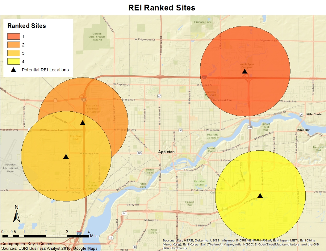
Figure 11. Potential REI locations based on rank.

3 Conclusions

Based on the findings in the geospatial analyses, the following conclusions were summarized:
  1. Appleton has a younger population than Oshkosh or Green Bay, a larger working class, and a population that is projected to continue increasing. 
  2. These potential locations are also in between the two ideal customer areas.
  3. There is not as large of a competition compared to other large cities that surround Appleton. However, based on what the competition does sell, REI offers different products then well known places like Dick's or Scheels sell. They focus on all different types of sports, hunting, fishing, etc. REI specializes in different outdoor activities such as biking, hiking, water sports, etc.
  4. Cities with smaller populations that are closer in proximity to Appleton are more likely to have more of their population shop in Appleton, compared to Green Bay that has a higher population and less likely have more people shop in Appleton than Green Bay. 
  5. There is a large population of people that have a high median income around the suburbs of Appleton. 

4 Recommendations

After assessing the different dynamics of study site, the following recommendations were created in order to provide the best possible suggestion for a new REI location. 

  1. Appleton would be a great location because it is a MSA that is between large cities including: Green Bay, Oskhosh, Neenah, etc. 
  2. The site that was ranked number one would be beneficial for REI to locate at because of the future development. This area is currently growing it's business district, residential areas, and recreational opportunities. It is considered the newer part of Appleton. It is also not that far from the downtown. This location is also very close to I-41 as well as Highway 441.
  3. The age of the population is great market. Majority of the populaiton is between 25 and 54. This age is part of the working class so the income could be spent on buying equipment for recreational uses. The population is also in an independent and capable age that would engage in outdoor activities. 
  4. A market for families could also be beneficial because of the high population of children under the age of 14. 

5 References

City of Appleton. (2015). Appleton Comprehensive Plan. Retrieved from Envision Appleton: http://www.envisionappleton.org/
ESRI. 2016. "Esri Business Analyst."
REI Co-op. (2017). REI Overview. Retrieved from REI: https://www.rei.com/about-rei/business.html
US Census Bureau. (2015, July). Metropolitan and Micropolitan Statistical Areas of the United States and Puerto Rico. Retrieved from US Census: https://www2.census.gov/geo/maps/metroarea/us_wall/Jul2015/cbsa_us_0715.pdf


Wednesday, April 19, 2017

Assignment 4: Trader Joe’s Site Selection

1 Introduction

1.1  Purpose of this Study

The purpose of this study is work with Trader Joe’s in potential site selection for future development of their grocery stores. Trader Joe’s is looking to create a profit, therefore, an analysis of what is happening in the Minneapolis-St. Paul area will be conducted. In the end, there will be enough information to decipher where a new Trader Joe’s can be placed.

1.2  Scope of this study, sources, and methods

Customer data has been given for six different Trader Joes in Hennepin and Ramsey Counties in Minnesota (Figure 1). Each customer is also fixed to the Trader Joe’s store they are loyal to.
Figure 1. Location of Trader Joe'e in Hennepin and Ramsey Counties.
To understand the study area, a series of analyses will be completed: a market penetration report, finding the optimal store location, locating ideal customers, and selecting three sites and ranking them. Market penetration is a method that determines how well the market is being reached. The number of customers are divided by the total number of people in each area (zip codes) to give a percentage of how well the market is being penetrated. The optimal location will be found by detecting the mean center of all of the Trader Joe's customers. The ideal customers tool uses a method that identifies the threshold of some variable at a geographic area such as zip codes. Hot spots identify areas with high values at a given geographic scale. And lastly, ranking sites allows one to see which sites could potentially out perform the others. The rank will be based on the following variables:

Variables
2016 Total Income
2016 Median Household Income
Ind: Avg. Spent per Week by HH at Food Stores $150+
Shopped at grocery store/6 mo: Trader Joe's

The sites need to be selected based on an area that would be large enough for a Trader Joe's to actually be built, not just a general location. A 1.5 mile buffer will surround the potential sites to assess the criteria listed above. 

2        Findings and Discussion

2.1  Data Provided

The customers for Trader Joe’s are sporadically located across Hennepin and Ramsey County. Six zones can clearly be spit based on the stores. Each grocery store has a clear number of customers that are loyal to a particular location shown in Figure 2. One thing to note is that there are not as many Trader Joe’s customers to the west of the study area.
Figure 2. Location of Trader Joe's customers by store.

2.2  Optimal Location

The optimal location was influenced by the customers. By finding the mean center of the customers, a location was placed near downtown Minneapolis (Figure 3). The city of Minneapolis itself does not have customers clustered in its bounds. Due to the infrastructure of businesses and entertainment that are prominent in downtown Minneapolis, there are not many customers living there. The mean center in this particular instance may not be the best because there are still current Trader Joe’s locations that could be closer to the customers.
Figure 3. Mean center of Trader Joe's customers.

2.3  Market Penetration

To inspect how well the market is reached in the MSP area, the number of customers is divided by the total number of people in each area. This is based on total population in each zip code. The 2016 Total Population is 56,104 people for the study area with a Median Household Income of $145,958. With these statistics in mind, the percentage of how well Trader Joe’s is penetrating the market is more prominent in the Minneapolis and St. Paul areas. This is where 4 of the 6 Trader Joe’s are located (Figure 4).
Figure 4. Market penetration of customers. 

2.4  Hot Spot Analysis

The map in Figure 5 shows hot spots (clusters) of high population based on the Median Household Income. Typically, those with higher incomes do not live in the heart of the city (Minneapolis-St. Paul). This is why majority of the yellow overlays the Twin Cities, while the red lies more towards the suburbs.
Figure 5. Hot spots of population based on median household income.

2.5 Ideal Customers

Locations that contain potential areas for future development are shown in Figure 6. The ideal customers are classified by zip codes and contain a population with at least 20,000 people. Contrary to past analyses, the prospecting customers are located outside Minneapolis-St.Paul specifically. In other words, the customers are not in the heart of the two large cities but in the cities around them. However, looking at ideal customers takes into consideration the entire population of the area. This could useful when looking for new markets or future potential customers. 
Figure 6. Ideal customers of Trader Joe's.

2.6 Ranking Site

After looking at the demographics of the customers, population, and store locations, three sites were selected for potential future development locations for Trader Joe’s. These sites that were selected were on empty lots in commercial areas around The Cities. With a 1.5 mile buffer around the three sites, variables were considered in order to see which sites may outperform others. The variables included 2016 Total Income, 2016 Median Household Income, the Average Spent per week by Households at Food Store $150+, and Shopped at Grocery store (Trader Joe’s). Figure 7 shows that the number one site is located North West of the cities. There is only one Trader Joe’s in that direction along with a large cluster of customers. The second best option was East of St. Paul where there is not a Trader Joe’s that close. The last site is not as ideal as the other two. After it was geocoded, the location was too close to another store. That would create competition between the customers.
Figure 7. Ranking site of potential locations for Trader Joe's.


3        Conclusions & Recommendations

The ranked sites were heavily influenced by ideal customers in the selection process. The first and second site are located closely to an ideal customer area. All three of the sites are in the highest percentage block. However, the third site is in a less populated area. Site 1 is the nearest to the mean center as well. After the ranking of the sites was completed, the northern most site was selected based on the series of variables. With all other analyses in mind, in the end, Site 1 would be the best selection for another Trader Joe's to built at 5801 Xerxes Ave. N, Minneapolis, MN 55430 (45.060469, -93.321479). 


4        References


ESRI. 2016. "Esri Business Analyst."

Monday, April 3, 2017

Assignment 3: Real Estate

Introduction

Using real estate analysis, our goal is to sell a home that is found within the Third Ward  neighborhood of Eau Claire.  This area has prices that extend from $80K to around $700K for the historic homes within the area, therefore determining the fair-house value needs to be accurately based on nearby houses with similar features along with taking into account the house's overall quality.  Simultaneously, the house will need to account for its primary customers to understand the market for this housing option.  

The price is going to be determined based on the following qualities;
  • The location of the house
  • Value of surrounding real estate
  • Features found within the house (# baths / # bedrooms)
  • Recently sold real estate prices

FrontOfHouse.jpg
Figure 1: Front of house
The house being sold is located at 1111 Graham Avenue (Figure 1). The amenities of this house are as follows:
  • 4 bedrooms
  • 2.5 baths
  • 1,929 sqft
  • Lot size: 4,356 sqft
  • Single Family
Unique Features (Figure 2):
  • Hardwood Floors
  • Attached Garage
  • Large windows for large amount of light
    Livingroom.png
    Figure 2: Living Room
  • Updated Furnace in 2012
  • Large Living Room


This cozy four bedroom home is located in the Third Ward Neighborhood of Eau Claire, WI.  This house is found an equal distance from the University of Wisconsin - Eau Claire campus and the historic downtown making this house a great location for enjoying parks, downtown shops, and unique restaurants. This home was built a year after World War 2 which finished in 1946 to give this house the beautiful look of the time period giving it American appeal.  This house offers a great location, safety of Eau Claire, and the ability to make house improvements to one's unique style.

Location


QualityofLife.PNG
Table 1. Quality of Life.
This house is located in one of the historic areas of Eau Claire which has been positioned perfectly between downtown and the university.  It also has an easy access onto the highway about 5 minutes away.  To the east up a larger ridge is more middle-end houses built around the 1960s and 70s, and to the south there is a walking trail that connects a park to the university.  With the larger hill to the east and the main roads cutting a few blocks away this house offers less outfront traffic than other roads within a few blocks, and this house still offers its proximity to downtown while still being a quiet and quaint area.  Some other reasons this location is positive is because there is a high quality of Life located in the City of Eau Claire. By having a 93.9 score of the living index this area is a great place to settle down and buy a home (Table 1).  It is close to two major hospitals, has many hotel rooms for friends and family to come and stay, and if being bought as a property to rent out, it can rent out above the $709 average rental price due to the location of the home.    
Another reason this is a great location is the crime rate within the City of Eau Claire. The crime rate within the City is 210/100,000 people which is low for a city of this size making this a safe place to raise a family and another way to add value to the home (Table 2).
crimerate.PNG
Table 2. Crime Index
Local Housing Market
The Third Ward has some of the oldest houses found in the City of Eau Claire making it historic and beautiful (Figure 3).  Therefore, most of the housing stock in this area is going to be old and outdated, but still competitive for the area. The houses in the Third Ward will be taken care of better
Figure 3: Reference Map of Third Ward.
due to having less student rentals compared to the area to the Northwest, making this neighborhood more in demand compared to other neighborhoods at a similar price range. Even with having the oldest houses within the area the average number of defects is less than 2 within the third ward region (Figure 4). This can be compared to the student area housing to the Northwest that has many parcels of defects.  Therefore, the homes surrounding 1111 Graham Ave. show that the neighborhood is maintained and keep their high quality homes keeping housing prices consistent with the area.  

Figure 4: Number of Defects found within Third Ward in 2010. 
The Third ward can be divided up into a few different categories of people that live in the neighborhood.  It is rentals, single family homes, duplexes, three or more dwelling units and commercial.  With there being few large rental units except for the ones next to Bracket Hill and the elderly living places which are far away enough for there not to be a noise complaint from that area.  

Demographics

Eau Claire has a population of 67,385 according to the 2015 Census. The Dependency Ratio looks at three different cohorts:

P0-14 = Population in the 0-14 age group, also known as the Youth Dependency Ratio (YDR)
P65+ = Population in the 65+ age group, also known as the Elderly Dependency Ratio (EDR)
P15-64 = Population in the 15 to 64 age group

By using the total population data from the U.S. Census the equation can be written out as:
DR = 100 * (P0-14 + P65+) / P15-64 = (10,849 + 8,221) / 48,315 = 0.39 = 39%

Since the dependency ratio is at 39%, it can be concluded that the working age is more prominent in the city of Eau Claire. If a dependency ratio was high, those of working age face a greater burden in supporting the aging population. In this case, the dependents and the retired make up less of the total population than the working class. The largest age cohort, according to Census Data from 2015, is the 20 to 24 years taking up 15.6% of the population in Eau Claire. Eau Claire is considered a college town due to the University of Wisconsin-Eau Claire. However, people ranging in age from 25-54 also take up a large portion of the population. Eau Claire area is also a great area for families even with the University. There is many opportunities to be taken advantage of in the city ranging from entertainment to large corporation such as JAMF software and RCU headquarters.

Future Development and Attractions

Downtown Eau Claire has been known for their special events to bring people to the downtown. Eau Claire continues to find ways to bring entertainment, recreational, and cultural activities to the city. There is a plethora of indoor and outdoor activities such as music, arts, conferences and shows. These attractions include the L.E. Phillips  Memorial Library, State Theater, Children's Museum, and Boys and Girls Club. Future contributions to the city will include a community performing arts center, The Confluence (Figure 5), as well as a new Civic Center and riverfront parks and trails, considering the Chippewa and Eau Claire River adds a natural attraction to the city layout.
Figure 5: Proposed Performing Arts Center

The value of the riverfront will greatly increase when The Confluence is completed. With the combination between The Confluence and the newly finished Lismore Hotel, other investments in the South Barstow District will be created especially in the 200 and 300 block (Figure 6). The plan is to seek out for new and better restaurants, cafes, and bars in the different areas of downtown.
Figure 6: Future district growth in downtown Eau Claire.

Eau Claire is also known for it’s many green spaces, including Carson Park, Owen Park, the Chippewa River Trail for biking and recreation activities, and most importantly Phoenix Park where Eau Claire’s famous Farmers Market is held. To continue the diversity of Eau Claire’s green spaces, a small park will be placed by City Hall and the Library (Figure 7).
Figure 7: Future green space project.

Suggested Sale Price

To determine the sale price for this home there are some factors that need to be taken into account.  First, the price of nearby houses that have recently sold that are close in square footage and number of rooms/bathrooms.  Also, the quality of the overall home needs to be taken into the equation.  And finally, what the seller wants to get out of the house.  These variables all factor into the final price.  
Table 3: Housing Price comparision
Some of the houses that have recently sold around the area are referenced in Table 3 to understand the estimated price determined for this property.

Based on these factors,the consensus was to value the house at $143,864. The price was decided based on the value of similar homes in the area as depicted above in Table 3.

Sources:
US Census: https://factfinder.census.gov/faces/nav/jsf/pages/index.xhtml

Friday, February 24, 2017

Assignment 2: Study Areas, Geocoding, Customers, and Trade Areas

1 Introduction

1.1  Purpose of this study

In San Francisco County, CA, two friends are owners of two separate coffee shops. Both of them want to maximize their trade areas in a way that benefits both businesses. Under the circumstance that they do not want to compete against one another. In order to maximize the trade areas, the competitive market needs to be addressed. This entails looking at where the customers are coming from, understanding the competition, and the accessibility to the coffee shops.

1.2  Scope of this study, sources, and methods

Both stores have provided the addresses of their respective customers as well as the addresses to the coffee shops. One map will show where the customers are coming from in relation to the two coffee shops based on the geocoded addresses that were provided. The customers will be divided into those that choose to be loyal to coffee shop 1 and coffee shop 2. Coffee shop 1 will be addressed as the shop to the north of San Francisco County and Coffee shop 2 will be referenced as the shop to the south of the county, shown in Figure 1. Mean centers will also be calculated for each business so see the mean area where customers are located.
Figure 1. Reference map of the Coffee shops in San Francisco County. 

Another map will analyze the competition in San Francisco County for the two coffee shops. ESRI Business Analyst provides the data for the locations of other coffee and doughnut businesses in the area. The next map looks at the customer derived trade areas for the two coffee shops. These areas will assess whether the two owners will have competition against each other. After looking at the trade areas, a final map will demonstrate the walk/drive times to the businesses. Most of the customers walk to the coffee shops, so the distance radius is altered to fit purpose of the map.

2 Findings and Discussion

2.1 Customers

After the addresses of each respective customer was geocoded in Business Analyst, the distribution of customers was based on relative location to the coffee shop. Figure 2 has a divide in the county in relation to its customers. The Store 1 customers are closely clustered around the coffee shop compared to Store 2 customers. Store 2 has a big more spread and more customers that travel farther to attend Store 2. This is proven also by looking at the mean center. The mean center of Store 1 is so tightly clustered that the mean center symbol is touching the coffee shop symbol for Store 1. As for Store 2, the mean center is lightly farther off of Store 2. After reviewing the locations of the locations of the respective customers, not as many live as close to Store 2 (compared to Store 1), but the customers are coming from longer distances. One thing to point out is that there is a few outlying customers. Some of Store 1’s customers are mixed in the Store 2 region and vice versa.
 
Figure 2. Location of Respective Customers for each Coffee Shop with the Mean Center of the customers.

2.2 Competitors

The majority of competitors are clumped in the northeast corner of the county, surrounding San Francisco, CA. This near the Union Square, Financial District and South market of San Francisco. Store 1 is approximately two miles from the center of the competitors, which can be seen in Figure 3. However, Store 1 more susceptible to competition compared to Store 2. Store 2 only has a few other competitors around it, but none so close that they are practically next to each other.
 
Figure 3. Location of the other Coffee and Doughnut Shop Competitors.

2.3 Customer Derived Trade Areas

The trade areas were based on the customers. Figure 4 includes a multiple ring buffer around the coffee shops indicating where 40%, 60%, 80% of the customers are located for each store. The population within the 80% radii is 128,925. The largest age cohort (25-34) takes up 27.5% of that population. Followed by 15-24 and 35-44 being the next largest cohorts. The population that surrounds both of the businesses is mainly young adults.
Figure 4. Customer Derived Trade Areas with buffers at 40%, 60% and 80%. 

 The first assumption that can be made is that Store 2 has a larger trade area than Store 1. The customer derived trade area is more stretched out due to the spread of customers. The 40% of Store 1 extends over 2 miles roughly. 80% of the customers need to be reached a farther distance. Comparing this to Store 1, much of that market is between a mile and 1.5 miles. Therefore, Store 1 does not have to go as far to advertise its business. One thing to note is the consumer spending. In 2016, within the 40% radius of both businesses, the average spent on food away from home was $4,164.45 and the total amount was $62,749,905. This numbers are for any food, but bakeries and coffee shops are included in that spending amount.

2.4 Drive/Walk Times

Considering many of the customers walk to these coffee shops, the walk/drive distances had a multiple ring buffer at .5 miles, 1 mile, and 1.5 miles in Figure 5. Referring back to the customer derived trade areas in Figure 4, 80 percent of the customers were within about two miles of the business. Taking into considering the walking routes or accessible roads within the 1.5 mile radius, the buffers are altered to fit the specifications. The customers for both businesses are tightly clustered around the location of the coffee shops. Looking specifically at store 1, many of the customers fill the .5 mile area as well as the mile radius. Store 2 has a similar pattern, but still a significant amount of customers in the 1.5 range. Store 2 has a customer base that is willing to travel a little farther than the customers at Store 1.
 
Figure 5. Walk/Drive Times for each coffee shops with buffers at 0.5 miles, 1 mile, and 1.5 miles.

3 Conclusions

The customers are willing to travel farther distances to Store 2 more because there is less competition on the southern half of the county. Store 1 is located closer to the central business district of San Francisco County. That leaves the customers location being significantly closer. With more competition around, they do not have to travel as much to get the coffee or doughnut product. Simply, Store 2 has a widespread of customers, while Store 1 has a more closely compacted spread of customers. It seems a though a line could be drawn through the county that will distinguish between customers of Store 1 and Store 2. By not having a mix within their customers, the competition with the two businesses will not have to be an issue.  Store 1 will have to take into consideration the high concentration of competition in the northeastern part of the county, specifically to the east of the business. For Store 1, its trade area could be extended. There is a higher chance of customers from farther distances willing to come to the coffee shop, but not as far as interfering with Store 1’s customers. 

4 Recommendations

After considering the findings and conclusions of this study, the following recommendations can be made to maximize the trade area for Store 1:
  1. Extend the trade area to the Richmond District. A handful of customers have identified their location in the surrounding areas of the district.
  2. Create a promotion around the Golden Gate Park. This could attract tourists or influence anyone doing recreational activities to stop at the shop for a break.
  3. Maximizing the trade area east of the business will create a more competition for the San Francisco area.
  4. Note that the Mission District is heavily influenced by Store 2 customers to the south, and Potrero district is in the “dividing” line of the two store customers.

Based on the findings for Store 2, the following recommendations to maximize the trade area include: 
  1. Trade areas should be extended farther distances to a 3 to 5 mile radius around the business, as long as it does not interfere with the alterations of Store 1. Look specifically to extending it to the northeast or south east of the store.
  2. To attract an area that has minimal competition and not as many customers, the southwest corner of the county would be an area to advertise to people who do not have great access to coffee and doughnuts. 
  3. Diamond Heights would be a community that would be worth extending the trade area too.
  4. City College of San Francisco is within the 1.5 mile buffer. Promoting a coffee shop to college students would be a great investment in the business. Many students find that coffee shops are great places to study and run on caffeine.
  5. Since customers are willing to travel longer distances for Store 1, San Francisco State University could be a good area to maximize the trade area. 

5 Appendix

Data can be found publically in the Q:Drive of the University of Wisconsin-Eau Claire’s server.

Retail Goods and Service Expenditures:


Data Note: The Spending Potential Index (SPI) is household-based, and represents the amount spent for a product or service relative to a national average of 100. Detail may not sum to totals due to rounding. This report is not a comprehensive list of all consumer spending variables therefore the variables in each section may not sum to totals.

Source: Esri forecasts for 2016 and 2021; Consumer Spending data are derived from the 2013 and 2014 Consumer Expenditure Surveys, Bureau of Labor Statistics

6 References

ESRI. 2016. "Esri Business Analyst."


Monday, February 6, 2017

Assignment 1: Population Dynamics

Coonen Be Happier® Investments

Executive Summary

Purpose and Method of this report

Coonen Be Happier Investments has been granted the opportunity to capitalize an extensive amount of money into a new business that is located in Jacksonville, FL. This imposes the question of what is the age structure of the overall population breakdown in Jacksonville compared to the State of Florida and the U.S. as a whole. The spatial analyst of Coonen Be Happier Investments investigated the population structure of Jacksonville as well the overall cultural and service sectors of the city. 
The population data was taken from the U.S. Census using ACS data for 2015 for Jacksonville City, Florida.

  • ·     First part of investigating the structure of the population is assessing a population pyramid. Population pyramids are graphic representations of a given areas’ population structure, which is broken down into two parts: gender and age.
  • ·        Dependency ratios were also calculated for the Jacksonville population data.
  • ·         Location Quotient can also be used as part of the structural breakdown of the population.

Findings and conclusions

After conducting the analysis that breaks down the structure of the population for Jacksonville, FL, many of the suggested proposals for the investment will not work well enough to create a profit. The dependency ratio also concludes that there is no growing lower population or large number of retirees. Due to this stationary pyramid shape, Coonen Be Happier Investments would want to focus their investments on the working class.
After first identifying the total Hispanic population, it was clear that there was not a large population of Hispanics in Jacksonville. The U.S. has 17.1% Hispanic population, where Jacksonville only has 8.5%. After the dependent population, retirees, and Hispanic population were eliminated from the possibilities for investing, another variable had to be analyzed.
U.S. has moved toward the tertiary and quaternary sectors, these six sectors consist of 63.9% of Florida’s industries and 64.5% of Jacksonville’s industries. In short, the Service Industries for Jacksonville have a significant impact on the economy due to the large opportunity for workers and has a low dependency ratio. Therefore, there is taxes going back into the economy and potential for job growth.

Recommendations for the investment


After reviewing all of the data, Coonen Be Better should invest their money into the working class. Considering, there is a University in Jacksonville, there will be plenty of graduates continually coming from the University looking for a job. However, even though the Educational Industry is the largest service industry in Jacksonville, the money could be invested more efficiently. The Professional Sector, Finance, and Arts are also a large part of the industries. To prevent great competition in our company, investing within one of those three sectors would be a great business choice.

1      Introduction

1.1       Purpose of this study

Coonen Be Happier Investments has been granted the opportunity to capitalize an extensive amount of money into a new business that is located in Jacksonville, FL. For the moment, the money does not have a particular business that it will be assisting yet. One employee expressed in interest in developing a business model that will fit the needs of the growing population of young children. Another employee wants to direct the funds to retirees to create revenue. Another approach would be to invest the money into Hispanic populations. This imposes the question of what is the age structure of the overall population breakdown in Jacksonville compared to the State of Florida and the U.S. as a whole. The spatial analyst of Coonen Be Happier Investments investigated the population structure of Jacksonville as well the overall cultural and service sectors of the city. 

1.2       Scope of this study, sources, and methods

First part of investigating the structure of the population is assessing a population pyramid. Population pyramids are graphic representations of a given areas’ population structure, which is broken down into two parts: gender and age. Each pyramid also has two sides, one for male and one for female. The first cohort is 0 to 4, second 5 to 9, and so on, all the way to 85%.  The cohorts represent the percent of total population for males and females in each cohort. The population data was taken from the U.S. Census using ACS data for 2015 for Jacksonville City, Florida.
Dependency ratios were also found for the Jacksonville population data. This ratio is a simple calculation that compares youth and elderly populations to the population of the working ag: DR = 100 * (P0-14 + P65+) / P15-64.
Location Quotient can also be used as part of the structural breakdown of the population. The LQ is a measure of concentration that indicates the geographical concentration of a particular variable in a certain region compared to another geographical area. The closer the number is to 1, if not one, means that the city, county, or state has the exact make-up as the US.


2       Findings and Discussion

The findings will be demonstrated in three categories:
  • ·         Population Pyramids
  • ·         Dependency Ration
  • ·         Location Quotient


2.1       Population Pyramid

Population pyramids illustrates the age and sex of a given population. The shape of a pyramid allows for a number of assumptions. This particular population pyramid, shown in Figure 1, demonstrates a stationary population that also has a declining birth rate, low death rate, and a long life expectancy.

Figure 1. Population Pyramid of Jacksonville, FL separated by % Male and % Female based on a series of age cohorts.

Based on this pyramid, the higher concentration of population on both sides is in the 25 to 29 years cohort and the 50 to 54 years cohort. Even though the middle is convex, the population is still greater than the top and the bottom. These areas are also highly correlated to the working class.

2.2       Dependency Ratio

The Dependency Ratio looks at three different cohorts:
P0-14 = Population in the 0-14 age group, also known as the Youth Dependency Ratio (YDR)
P65+ = Population in the 65+ age group, also known as the Elderly Dependency Ratio (EDR)
P15-64 = Population in the 15 to 64 age group
By using the total population data from the U.S. Census the equation can be written out as:
DR = 100 * (P0-14 + P65+) / P15-64 = (166,002 + 102,481) / 578468 = 0.46 = 46.4%
Since the dependency ratio is at 46.4%, it can be concluded that the working age is more prominent in the city of Jacksonville. If a dependency ratio was high, those of working age face a greater burden in supporting the aging population. In this case, the dependents and the retired make up less of the total population than the working class.

2.3       Location Quotient

The total population is firs defined in the four categories and then broken down into Total Pop. 0-14, Total pop. 65+, Total Hispanic Pop., and Total White Pop. The percentages of each category is also defined in Table 1, as well, in order to calculate the location quotient.


Table 1. Online Census Data of Total Population for various groups and their percentages of the total population based on city, county, state, and U.S.

Total Population
Total Pop.
0 -14
Percent Pop.  
 0-14
Total Pop. 65+
Percent Pop. 65+
Total Hispanic Pop.
Percent Hispanic Pop.
Total White Pop.
Percent White Pop.
Jacksonville
 846,951
166,002
19.6%
 102,481
12.1% 
 72,338
8.5%
 508,704
 60%
Duval County
 890,673
171,900
19.3% 
 108,662
 12.2%
 74,775
 8.4%
 547,556
 61.5%
Florida
19,645,772
3,339,781
 17%
3,634,468
18.5%
4,660,733
 23.7%
14,934,702
 76%
United States
316,515,021
61,087,399
 19.3%
44,312,102 
 14%
54,232,205
 17.1%
232,946,055
 73.6%

After calculated each of the Location Quotients (LQ) in Table 2, it is concluded that the variable with closest make-up of the U.S. is the LQ (white). With a value of 1.03, it is the closest to 1. Many of the values are greater than the U.S., meaning that the population is over representative of the U.S. total population. However, the LQ (Pop. 0-14) is actually lower than 1 at 0.88. Therefore, the population is lower than the U.S. total percentage.

Table 2. Location Quotient for town, city, and state.

Due to the fact much of the U.S. has moved toward the tertiary and quaternary sectors, the numbers for Jacksonville and Florida separately were looked at. To learn what service sectors reside in Florida and Jacksonville the data for Finance, Professional, Educational, Arts, Other, and Public Administration, as well as their proportion of the total state population, were compiled into Table 3 below.

Table 3. Service sectors that reside in Florida and Jacksonville such as Finance, Professional, Educational, Arts, Other, and Public Administration, as well as their proportion of the total state population.
Service Industries - State
Percent of total state Industries
Service Industries – Jacksonville
Percent of total Jacksonville Service Industries
Jacksonville location quotient
1 Finance

7.7%
1 Finance
11.6%
1.51
2 Professional

12.7%
2 Professional
12.5%
.98
3 Educational

21.3%
3 Educational
20.5%
.96
4 Arts

12.2%
4 Arts
10.1%
.83
5 Other Services

5.4%
5 Other Services
4.9%
.91

6 Public Administration
4.6%
6 Public Administration
4.9%
1.07

These 6 sectors make up 63.9% of Florida’s industries and 64.5% of Jacksonville’s industries. It is easy to see that based on the location quotient for Jacksonville in Table 3, that many of them are close to the same make up. For example, Professional, Educational, Other Services, and Public Administration are within .1 away from the value of 1.


3       Conclusions

After conducting the analysis that breaks down the structure of the population for Jacksonville, FL, many of the suggested proposals for the investment will not work well enough to create a profit. The population pyramid suggests that the most populated cohorts were in 25 to 29 years and 50 to 54 years. The population between the cohorts was also greater than the ends as well. The dependency ratio also concludes that there is no growing lower population or large number of retirees. Due to this stationary pyramid shape, Coonen Be Happier Investments would want to focus their investments on the working class.
                After first identifying the total Hispanic population, it was clear that there was not a large population of Hispanics in Jacksonville. The U.S. has 17.1% Hispanic population, where Jacksonville only has 8.5%. In the town, county, state, and U.S., the total white population percentage was nearly two-thirds to three-quarters of the population. Meaning, that the white population is the dominate population for the city. When the Location Quotient was calculated for particular areas, it can be justified that Jacksonville and Florida are a close match-up to the U.S. total population.
                After the dependent population, retirees, and Hispanic population were eliminated from the possibilities for investing, another variable had to be analyzed. It was shown in the dependency ratio and the population pyramid that working class was the largest population in Jacksonville, FL. Due to the fact much of the U.S. has moved toward the tertiary and quaternary sectors, data for Finance, Professional, Educational, Arts, Other, and Public Administration was analyzed to see if there was any significance. These six sectors consist of 63.9% of Florida’s industries and 64.5% of Jacksonville’s industries.
The Educational Industry had at the largest percentage in Florida and Jacksonville. Florida has a many universities in its state. For the city, this is most likely due to Jacksonville State University and the fact that it is also a Division I school. This large university provides a large number of jobs for this particular area. In reference back to the population pyramid, this would also explain the large number of 20+ year-olds being a largest cohort.
In short, the Service Industries for Jacksonville have a significant impact on the economy due to the large opportunity for workers and has a low dependency ratio. Therefore, there is taxes going back into the economy and potential for job growth.

4       Recommendations

                After reviewing all of the data, Coonen Be Better should invest their money into the working class. Considering, there is a University in Jacksonville, there will be plenty of graduates continually coming from the University looking for a job. However, even though the Educational Industry is the largest service industry in Jacksonville, the money could be invested more efficiently. The Professional Sector, Finance, and Arts are also a large part of the industries. To prevent great competition in our company, investing within one of those three sectors would be a great business choice.

5       References

U.S. Census Bureau. (2016). United States Census Bureau. Retrieved from American Fact Finder: https://factfinder.census.gov/faces/nav/jsf/pages/index.xhtml